FMP
Fundamentals at Your Fingertips: FMP Income Statement API Essentials
Dec 06, 2025
Fundamentals at Your Fingertips: FMP Income Statement API Essentials
An income statement is a key tool for understanding how a business generates profit, and the FMP Income Statement endpoint makes this information easily accessible for both retail and institutional traders. With just one request, you can obtain detailed financial data, calculate profitability ratios, develop growth and quality screens, and compare peer companies efficiently using both single-symbol and bulk endpoints.
What Is an Income Statement?
The income statement details a company's revenues, expenses, and profits within a specific period, usually a quarter or a year. It provides insights into the sales volume, the costs incurred to generate those sales, and the remaining operating and net income after deducting all expenses and taxes.
Public companies release income statements in quarterly and annual reports, usually within 2-6 weeks after each fiscal period ends. Regulations and listing requirements, such as the SEC's Exchange Act filings with Forms 10‑Q/10‑K in the U.S. and the EU Transparency Directive using IFRS reporting in Europe, mandate this disclosure.
For traders and investors, the income statement is essential as it shows profitability, operational efficiency, and performance trends over the cycle. Many common ratios, including gross margin, operating margin, and earnings per share, are calculated directly from income statement line items.
Endpoint Overview
FMP offers an Income Statement endpoint for a particular company. You just need to have the:
- api-key: your api key
- symbol: the symbol you are interested in. In the example Python code below, we will request the stock quote of Apple stock (AAPL).
- period: annual, quarter, Q1, Q2, Q3 and Q4 are the available values
- limit: how many historical periods the endpoint should return
Before you proceed, make sure to have your own secret FMP API key. If you don't have one, you can easily it obtain it by opening an FMP developer account.
|
import requests url = 'https://financialmodelingprep.com/stable/income-statement' symbol = 'AAPL' querystring = {"apikey":token, "symbol":symbol} resp = requests.get(url, querystring).json() |
With the simple call below, providing only the symbol, the API returns a list of dictionaries with the five latest annual income statements, each with the following data fields:
|
Variable Name |
Description |
|
date |
Date of the fiscal period end for this statement. |
|
symbol |
Stock ticker identifying the reporting company. |
|
reportedCurrency |
Currency units used for all monetary values. |
|
cik |
Unique SEC identifier for the filing company. |
|
filingDate |
Date when the financial report was submitted. |
|
acceptedDate |
Timestamp when SEC officially received filing. |
|
fiscalYear |
Calendar or fiscal year of the period. |
|
period |
Time frame covered: FY (Fiscal Year) or quarter. |
|
revenue |
Total sales and service income generated. |
|
costOfRevenue |
Direct costs to produce sold goods/services. |
|
grossProfit |
Revenue minus cost of revenue amount. |
|
researchAndDevelopmentExpenses |
Costs for innovation, product development. |
|
generalAndAdministrativeExpenses |
Overhead costs like salaries, office expenses. |
|
sellingAndMarketingExpenses |
Promotion, advertising, sales team costs. |
|
sellingGeneralAndAdministrativeExpenses |
Combined selling, G&A, marketing expenses. |
|
otherExpenses |
Miscellaneous non-operating expense items. |
|
operatingExpenses |
Total R&D, SG&A, other operating costs. |
|
costAndExpenses |
Sum of all revenue and operating costs. |
|
netInterestIncome |
Interest income minus interest expense net. |
|
interestIncome |
Earnings from interest-bearing investments. |
|
interestExpense |
Borrowing costs paid to lenders. |
|
depreciationAndAmortization |
Non-cash allocation of asset costs. |
|
ebitda |
Earnings before interest, taxes, D&A (Depreciation and Amortization). |
|
ebit |
Operating income before interest, taxes. |
|
nonOperatingIncomeExcludingInterest |
Gains/losses from non-core activities. |
|
operatingIncome |
Profit from core business operations. |
|
totalOtherIncomeExpensesNet |
Net non-operating income and expenses. |
|
incomeBeforeTax |
Profit after all expenses except taxes. |
|
incomeTaxExpense |
Taxes owed on pre-tax income amount. |
|
netIncomeFromContinuingOperations |
Profit from ongoing business activities. |
|
netIncomeFromDiscontinuedOperations |
Results from sold or closed business units. |
|
otherAdjustmentsToNetIncome |
Miscellaneous items adjusting final profit. |
|
netIncome |
Total profit after all expenses, taxes. |
|
netIncomeDeductions |
Additional subtractions from net income. |
|
bottomLineNetIncome |
Final comprehensive net profit figure. |
|
eps |
Net income per basic share outstanding. |
|
epsDiluted |
Net income per fully diluted share (includes convertible securities). |
|
weightedAverageShsOut |
Average basic shares during the period. |
|
weightedAverageShsOutDil |
Average diluted shares during period. |
So let's see what we can learn from this data.
Gross and Operating Margins
The primary use case involves calculating profitability ratios from revenue, cost of revenue, and other expenses. For instance, gross margin is calculated as the percentage of gross profit divided by revenue (Gross Margin = (Gross Profit ÷ Revenue)), as shown below.
|
single_income_statement = resp[0] gross_margin = single_income_statement['grossProfit']/single_income_statement['revenue'] print(f'Gross Margin is equal to {gross_margin*100:.2f}% for {single_income_statement["symbol"]}, period {single_income_statement["period"]} for {single_income_statement["fiscalYear"]} ') |
This will return:
![]()
In our example of Apple stock for the last fiscal year, this means that for every dollar Apple earns from sales, approximately $0.469 remains as profit.
Let's also look at the operating margin, which is calculated by dividing the operating income by the revenue (Operating Margin = (Operating Income ÷ Revenue)).
|
operating_margin = single_income_statement['operatingIncome']/single_income_statement['revenue'] print(f'Operating Margin is equal to {operating_margin*100:.2f}% for {single_income_statement["symbol"]}, period {single_income_statement["period"]} for {single_income_statement["fiscalYear"]} ') |
This will return:
![]()
This means that Apple earns 0.32 dollars for each dollar of revenue. In practice, this demonstrates exceptional cost control. Additionally, it indicates that Apple's focus on services growth (which have high margins) is boosting this metric more than selling iPhones.
Growth Lists and Screeners
A very interesting application is integrating these ratios into stock screeners. Typically, stock screeners allow investors to compare various stocks from a single list and identify opportunities that match their investment preferences.
FMP provides the Stock Screener API, a single, powerful endpoint to retrieve a list of stocks with basic data, which can then be enriched with income statement information. In our example below, we will enhance the screener data with the margins calculated earlier. First, we need to call the screener endpoint:
|
url = f'https://financialmodelingprep.com/stable/company-screener' querystring = {"apikey":token, "marketCapMoreThan":500_000_000_000, "country":"US", "exchange":"NASDAQ", "isFund":False, "isEtf": False} resp = requests.get(url, querystring).json() df_screener_stocks = pd.DataFrame(resp) df_screener_stocks |
With the above, we are identifying stocks on the NASDAQ exchange that have a market capitalisation exceeding half a trillion US dollars.
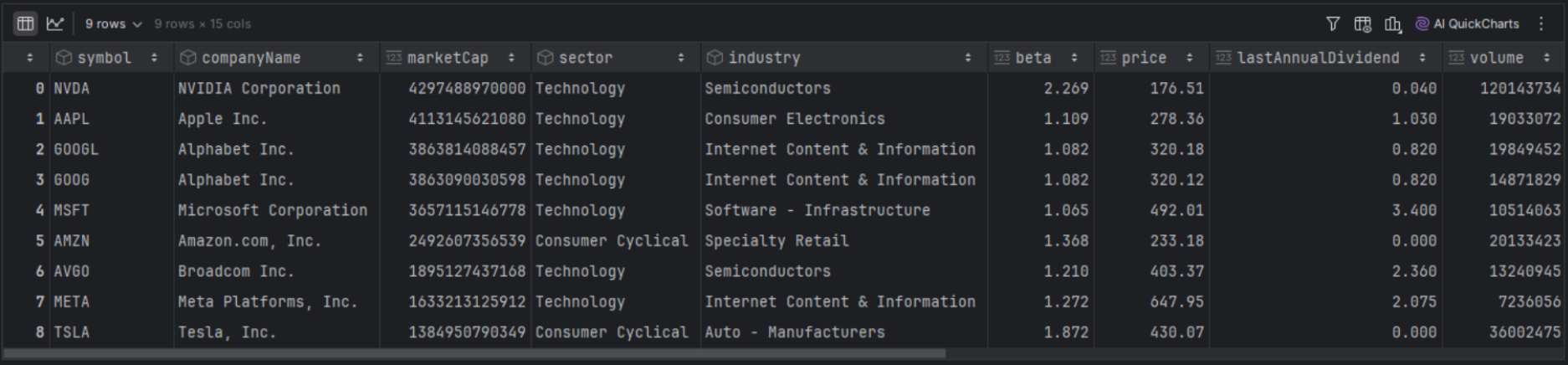
We are now processing each stock in our screener to call the income statement endpoint and update it with the gross margin and operating margin.
|
def income_statement_calculated_ratios(row): url = 'https://financialmodelingprep.com/stable/income-statement' symbol = row['symbol'] querystring = {"apikey":token, "symbol":symbol} resp = requests.get(url, querystring).json()[0] gross_margin = resp['grossProfit']/resp['revenue'] operating_margin = resp['operatingIncome']/resp['revenue'] return pd.Series([gross_margin, operating_margin],index=['gross_margin', 'operating_margin']) df_screener_stocks[['gross_margin', 'operating_margin']] = df_screener_stocks.apply(income_statement_calculated_ratios, axis=1) df_screener_stocks[['symbol', 'gross_margin', 'operating_margin']] |
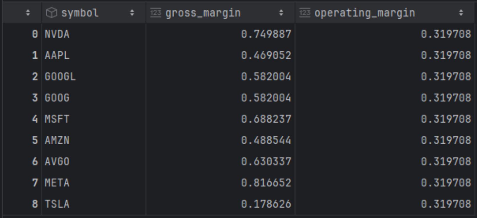
Based on the results above and proper sorting, Meta and NVIDIA lead in gross profit share with 81% and 74%, respectively, while Tesla ranks last. However, in terms of operating margin, Meta falls to third place behind NVIDIA and Microsoft. Further market financial analysis suggests that Meta's high R&D and marketing expenses (Reality Labs, AI) reduce gross profits into operating profits.
Peer Comparison With Bulk Peers
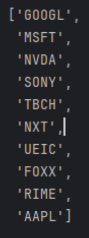
Comparing a stock to its peers becomes simpler when you don't have to manually select them from the universe. FMP offers the Peers Bulk API, a screener and classification endpoints that help you find companies within the same sector, industry, country, or other categories. Unlike the standard screener, this feature saves you time by directly identifying comparable stocks, making it easier to compare, for example, “Apple” with similar companies.
The peers API provides a comprehensive response of peers, and we only need to filter for Apple stock to obtain the results.
|
from io import StringIO symbol = 'AAPL' url = f'https://financialmodelingprep.com/stable/peers-bulk' querystring = {"apikey":token} resp = requests.get(url, querystring) df = pd.read_csv(StringIO(resp.text)) df = df[df['symbol'] == symbol] peers = df.loc[df['symbol'] == symbol, 'peers'].iloc[0].split(',') peers.append(symbol) peers |
This will return the list below:
Now we only need to call the income statement endpoint and calculate the margins in question.
|
df_peers = pd.DataFrame({'symbol': peers}) def income_statement_calculated_ratios(row): url = 'https://financialmodelingprep.com/stable/income-statement' symbol = row['symbol'] querystring = {"apikey": token, "symbol": symbol} resp = requests.get(url, params=querystring).json()[0] gross_margin = resp['grossProfit'] / resp['revenue'] operating_margin = resp['operatingIncome'] / resp['revenue'] return pd.Series( [gross_margin, operating_margin], index=['gross_margin', 'operating_margin'] ) df_peers[['gross_margin', 'operating_margin']] = df_peers.apply( income_statement_calculated_ratios, axis=1 ) df_peers[['symbol', 'gross_margin', 'operating_margin']] |
This way we will arrive at the following results:
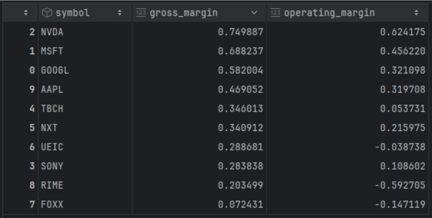
The results are expected, as the top four positions in both categories—dominated by the half a trillion companies—perform well in both areas, with the remaining companies trailing behind.
Extending Your Analysis
So far, we have focused on pulling a single income statement to compare companies against one another. However, the API offers much more than just a static snapshot; it allows us to request years of history in a single call to track performance over time. The following sections show how to extend this basic usage to build time-series visualizations, specifically by handling quarterly dates accurately and mapping EPS trends directly against price action.
Time Series and Price
Until now, in this article, we have examined a single income statement comparing companies to each other. However, FMP's Income Statement endpoint provides historical data, allowing us to extract more information from a single call and plot it in a time series to observe the evolution over time.
For this, we will use the EPS (earnings per share) metric provided directly from the income statement endpoint. First, we will obtain the historical quarterly data.
|
url = 'https://financialmodelingprep.com/stable/income-statement' symbol = 'AAPL' period = 'quarter' limit = 100 querystring = {"apikey":token, "symbol":symbol, "period":period, "limit":limit} resp = requests.get(url, querystring).json() df_income_statement_historical = pd.DataFrame(resp) df_income_statement_historical = df_income_statement_historical.sort_values('filingDate', ascending=False) |
One tip is to be able to create a specific date for the period reported. The endpoint provides the fiscal year and quarter, so it would be useful to assign an actual date corresponding to the end of that quarter, allowing for proper data plotting later.
|
def quarter_end_date(row): year = int(row['fiscalYear']) period = row['period'] # e.g. 'Q1' q = int(period.replace('Q', '')) # remove 'Q' and convert to int p = pd.Period(f'{year}Q{q}', freq='Q') return p.end_time.normalize() df_income_statement_historical['quarter_end'] = df_income_statement_historical.apply(quarter_end_date, axis=1) df_income_statement_historical[['fiscalYear', 'period', 'quarter_end']] |
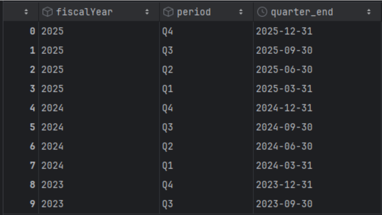
Now we are going to create a dataframe with the quarter's end date as an index and retain only the EPS.
|
df_income_statement_historical = df_income_statement_historical[['quarter_end','eps']] df_income_statement_historical['quarter_end'] = pd.to_datetime(df_income_statement_historical['quarter_end']) df_income_statement_historical.set_index('quarter_end', inplace=True) df_income_statement_historical = df_income_statement_historical.sort_index(ascending=True) |
Additionally, we will obtain the historical prices of Apple using the FMP Income Statement endpoint and retain only the adjusted closing price.
|
url = f'https://financialmodelingprep.com/api/v3/historical-price-full/{symbol}' df_ohlc = pd.DataFrame() min_dt = df_income_statement_historical.index.min() date_from = min_dt.strftime('%Y-%m-%d') querystring = {"apikey":token, "from":date_from} resp = requests.get(url, querystring).json() df_prices = pd.DataFrame(resp['historical'])[['date', 'adjClose']] df_prices['date'] = pd.to_datetime(df_prices['date']) df_prices.set_index('date', inplace=True) df_prices = df_prices.sort_index(ascending=True) |
Charting EPS and Price Together
Now it's time to plot meaningful data. We will chart Apple's prices and, at each quarter, display an arrow indicating whether the EPS increased (green) or decreased (red) from the previous quarter. The arrow's length will reflect the significance of the change.
To avoid becoming overwhelmed with data, we will define a specific time period for plotting. First, we will plot the last 5 years.
|
import matplotlib.pyplot as plt from_date = '2020-01-01' to_date = '2025-10-01' from_dt = pd.to_datetime(from_date) to_dt = pd.to_datetime(to_date) # price slice (DatetimeIndex) df_prices_range = df_prices.loc[from_dt:to_dt] # EPS slice (DatetimeIndex) df_eps_range = df_income_statement_historical.loc[from_dt:to_dt] eps = df_eps_range['eps'] # percentage change in EPS (e.g. 0.15 = +15%) eps_pct = eps.pct_change() # fractional change # eps_pct = eps.pct_change() * 100 # uncomment if you want 15 instead of 0.15 [web:130][web:133] up_dates = eps_pct[eps_pct > 0].index down_dates = eps_pct[eps_pct < 0].index fig, ax = plt.subplots(figsize=(12, 6)) # price line for selected period ax.plot(df_prices_range.index, df_prices_range['adjClose'], label='Adj Close', color='black') # price on EPS dates (nearest price) price_on_quarter = df_prices_range['adjClose'].reindex(eps.index, method='nearest') # scale arrow length with EPS % change base_len = 0.06 # base relative length of arrow vs price for dt in up_dates: y = price_on_quarter.loc[dt] change = eps_pct.loc[dt] # fractional, e.g. 0.15 length = base_len * (1 + abs(change)) # longer arrow for bigger change ax.annotate( f"+{change*100:.1f}%", # label like +15.0% xy=(dt, y * (1 + 0.02)), xytext=(dt, y * (1 + 0.02 + length)), arrowprops=dict(color='green', arrowstyle='-|>', lw=1.5), ha='center', va='bottom', fontsize=8, ) for dt in down_dates: y = price_on_quarter.loc[dt] change = eps_pct.loc[dt] length = base_len * (1 + abs(change)) ax.annotate( f"{change*100:.1f}%", # label like -8.3% xy=(dt, y * (1 - 0.02)), xytext=(dt, y * (1 - 0.02 - length)), arrowprops=dict(color='red', arrowstyle='-|>', lw=1.5), ha='center', va='top', fontsize=8, ) ax.set_xlim(from_dt, to_dt) ax.set_xlabel('Date') ax.set_ylabel('Price') ax.set_title(f'{symbol} price with EPS % change arrows ({from_date} to {to_date})') ax.legend() plt.tight_layout() plt.show() |
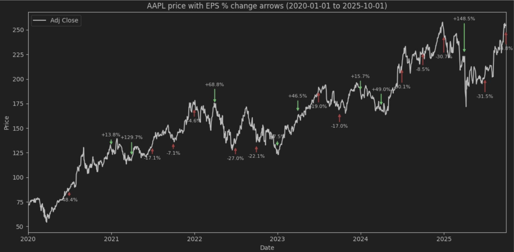
This plot shows how the price moved after a specific EPS in a period. Clearly, relying on just one metric will not provide the expected correlation (increased EPS should raise the price), as the price is influenced by many other factors. However, using this code, you can experiment with different metrics or even develop your own to see where it leads you.
Unlocking More with the Income Statement API
The FMP Income Statement APIs offer a versatile foundation for various types of fundamental data analysis, from analysing individual stocks to conducting large-scale peer or market comparisons. Providing essential key metrics or serving as a base for calculating more complex ones, these APIS give investors a valuable tool for comprehensive analysis.
By integrating this endpoint with the full FMP API suite, including features like prices, screener, and peers that we demonstrated, you can compare stocks to make informed decisions, as well as visualise metrics such as growth, quality, and profitability to support your analysis.
Explore the /income-statement endpoint today to enhance your applications with accurate market insights. Integrating it will improve your platform's ability to monitor stock fundamentals and discover new market opportunities.
Frequently Asked Questions
1. What is the difference between “eps” and “epsDiluted” in the API response?
“eps” represents the Net Income per basic share outstanding. In contrast, “epsDiluted” accounts for the impact of convertible securities, such as stock options, warrants, and convertible bonds, showing the value if these were exercised or converted into common stock.
2. Does the Income Statement endpoint provide pre-calculated profit margins?
The endpoint provides the raw line items needed to calculate them, such as “revenue”, “grossProfit”, and “operatingIncome”. You can easily calculate the Gross Margin by dividing Gross Profit by Revenue and the Operating Margin by dividing Operating Income by Revenue.
3. How do I switch between annual and quarterly financial data?
You can control the time frame of the data by using the “period” parameter in your API request. The available values for this parameter are “annual”, “quarter”, or specific quarters like Q1, Q2, Q3, and Q4.
4. Why might I need to use the Peers Bulk API alongside the Income Statement endpoint?
The Peers Bulk API helps you automatically identify comparable companies within the same sector or industry without manually searching for them. This allows you to quickly generate a list of ticker symbols (peers) to feed into the Income Statement endpoint for efficient benchmarking and comparison.
5. How should I handle dates when plotting historical data, given that companies use different fiscal years?
The API provides the “fiscalYear” and “period” (e.g., Q1), but these may not align with calendar quarters for every company. To plot data accurately on a time series, it is useful to write a function that assigns a specific calendar date corresponding to the end of that reported quarter.

MicroStrategy Incorporated (NASDAQ:MSTR) Earnings Preview and Bitcoin Investment Strategy
MicroStrategy Incorporated (NASDAQ:MSTR) is a prominent business intelligence company known for its software solutions a...

WACC vs ROIC: Evaluating Capital Efficiency and Value Creation
Introduction In corporate finance, assessing how effectively a company utilizes its capital is crucial. Two key metri...

BofA Sees AI Capex Boom in 2025, Backs Nvidia and Broadcom
Bank of America analysts reiterated a bullish outlook on data center and artificial intelligence capital expenditures fo...