FMP
Building Single-Stock Estimate & Price Target Heatmaps Without Heavy Code
Aug 25, 2025 4:06 PM - Sanzhi Kobzhan


Image credit: Financial Modeling Prep (FMP)
Why track price target heatmaps?
Analysts' forecasts for a stock can vary widely. For example, Apple's (AAPL) latest price targets span roughly $210-$230 - a significant dispersion around its current price. Visualizing this dispersion in a price target heatmap highlights the range of opinions.
Research shows high analyst target dispersion often signals uncertainty: when forecasts diverge, consensus targets can over-promise and future returns often disappoint. In this tutorial, we show how to use Financial Modeling Prep's APIs - pulling analyst price targets, financial estimates, and news - to build a single-stock heatmap. Using simple Python/JavaScript snippets or Google Sheets (via FMP's add-on), you'll cut through the noise and surface actionable sentiment on a stock's outlook.
Key Takeaways: With minimal coding, you can pull analyst price targets and company forecasts via FMP APIs, then visualize them in a heatmap or gauge. This highlights how much analysts disagree (dispersion) and what drives their outlook. Tracking this alongside live stock prices and news flow enables data-driven, timely decisions - cutting through noise to reveal true market sentiment.
Understanding Price Target Dispersion
Analysts set price targets to indicate where they expect a stock to trade in the future. When multiple analysts cover a stock, their targets form a “consensus.” However, the spread of individual forecasts - the dispersion - can be just as important.
Low dispersion (analysts roughly agree) suggests confidence; high dispersion (big spread between minimum and maximum targets) indicates uncertainty. In fact, a Yale study found that “high-dispersion” predictions tend to result in very poor stock returns. In other words, if one analyst expects AAPL at $210 but another at $230, this wide range warns us that consensus targets may be too optimistic.
For investors and executives, tracking dispersion helps gauge risk: a wide gap means analysts disagree on the company's near-term future, so you may want to dig deeper before acting.
Pulling Analyst Price Targets from FMP
To build a heatmap, first gather the raw data. FMP's Price Target News API gives the latest analyst forecasts for a given stock.
Each update includes:
- Price target
- Stock price when posted
- Analyst's name and firm
- A link to the news source
For example, querying the endpoint:
https://financialmodelingprep.com/stable/price-target-news?symbol=AAPL&page=0&limit=10&apikey=YOUR_KEY
returns JSON records like:
[
{ "symbol": "AAPL", "publishedDate": "...",
"newsTitle": "Apple price target lowered to $230 ...",
"analystCompany": "J.P. Morgan", "priceTarget": 230, ... },
{ "symbol": "AAPL", "publishedDate": "...",
"analystCompany": "UBS", "priceTarget": 210, ... },
...
]
Use your programming language's JSON parser or FMP's Google Sheets Add-on to load these fields. You can then extract the list of price target values and their dates.
In Python, a quick example is:
import requests

pt_data = requests.get("https://financialmodelingprep.com/stable/price-target-news?symbol=AAPL&apikey=KEY").json()

prices = [rec["priceTarget"] for rec in pt_data]
This gives you the set of target prices (e.g. [220, 210, 230]). From there, compute statistics like min, max, mean or standard deviation to quantify dispersion. For instance, AAPL's sample targets 210, 220, 230 yield a range of $20 and a standard deviation ≈8.2. This simple list becomes the basis for our heatmap.
Fetching Company Financial Estimates
Beyond price targets, analyst forecasts include company financials (revenue, EPS, etc.). FMP's Financial Estimates API delivers these projections.
It provides items such as:
- revenueLow/high/avg
- ebitdaLow/high/avg
- epsLow/high/avg
This API “collects forecasts from leading analysts” to give insights like Revenue Projections and EPS forecasts.
For example, an API call:
https://financialmodelingprep.com/stable/analyst-estimates?symbol=AAPL&period=annual&limit=5&apikey=YOUR_KEY
might return:
[
{ "symbol": "AAPL", "date": "2029-09-28",
"revenueLow": 479b, "revenueAvg": 483b, "revenueHigh": 487b,
"epsLow": 9.79, "epsAvg": 10.17, "epsHigh": 10.71, ... },
{ "symbol": "AAPL", "date": "2028-09-28",
... },
]
Now you can see, for each year, analysts' low/high/average forecast for revenue, EPS, net income, etc. Plotting these estimates (or their differences) alongside price targets reveals how fundamental outlook ties to valuation.
For instance, AAPL's 2028 revenue consensus is ~$455B, with a $31B high-low range - a wide spread reflecting modest analyst disagreement. In contrast, 2027 forecasts (with 19 analysts) only vary by ~$2.8B, a tight consensus. This underscores how the number of analysts often correlates with estimated uncertainty.
In practice, import this JSON into your sheet or script, then organize the columns (revenueAvg, epsAvg, etc.) for your heatmap.
Building the Heatmap (Code or Google Sheets)
Once the data is ready, visualize it with a heatmap. A heatmap is simply a colored table: cells are shaded by value (e.g. higher values = warmer colors). For a single-stock heatmap, you might use rows for forecast dates (or analysts) and columns for metrics (price target, EPS, revenue, etc.). Here are two low-code approaches:
Python/Seaborn
Install Pandas and Seaborn, load your data into a DataFrame, then call seaborn.heatmap(). For example:
import pandas as pd, seaborn as sns, matplotlib.pyplot as plt

df = pd.DataFrame({'PriceTarget': [230, 220, 210],'EPS': [10.7, 9.8, 9.0], 'Revenue': [486.97, 483.09, 455.03]}, index=['2029','2028','2027'])

sns.heatmap(df, annot=True, fmt=".2f", cmap="coolwarm")

plt.show()
This yields a colored grid: you can immediately see which forecasts are higher (warmer) or lower (cooler). Annotating helps (show numbers) and you can normalize scales if needed. No heavy coding - just format your extracted FMP data into a simple table and pass it to the heatmap function.
Google Sheets Conditional Formatting.
Copy your data into Google Sheets (or use the FMP Sheets add-on formulas like =FMP.HISTORICAL()). Then select the cells and use Format → Conditional formatting → Color scale. Choose a gradient (blue→white→red) and set min/median/max values. Sheets will automatically color each cell based on its value.
For example, put dates in column A, metrics (price target, EPS) in row 1, then the table fills with data. Applying a color scale highlights the highest targets in red and lowest in blue, making patterns pop. This approach requires no coding at all, only spreadsheet actions.
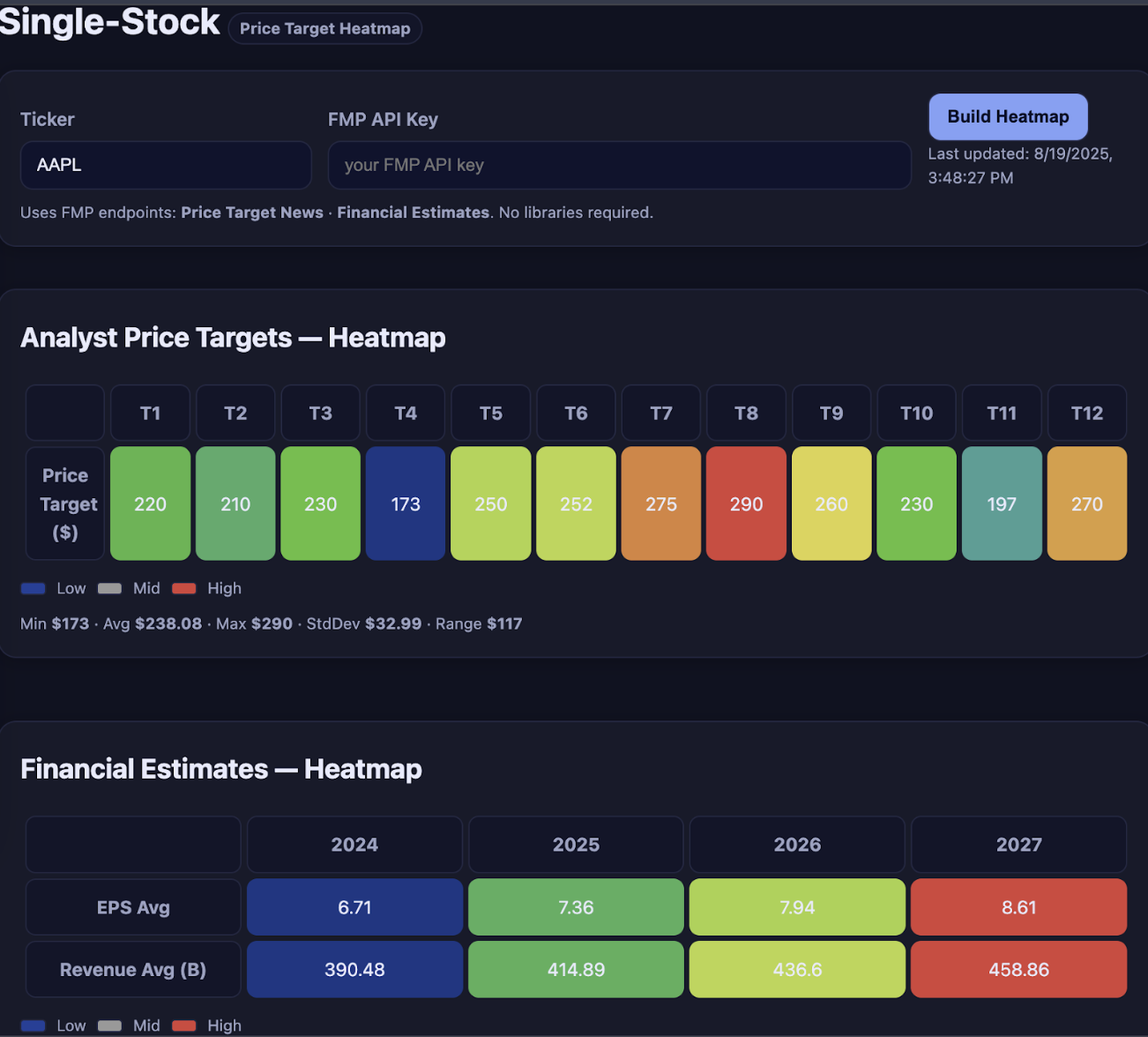
Example: Apple Forecast Heatmap
Let's apply this to Apple (AAPL). Using the Price Target News API, we got targets: 210, 220, 230. The min=210, max=230, mean=220. In a heatmap, we can mark these extremes: Min Target: $210, Max Target: $230. In Python, min(prices) and max(prices) give these easily, and you might visualize them on a simple gauge chart.
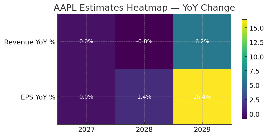
Next, from the Financial Estimates API we saw, for year 2028: RevenueAvg ≈ $455B (low $442B, high $474B), EPSAvg ≈ 8.73 (low 8.41, high 9.19). Adding these to the heatmap, we see 2029's estimates are higher than 2028's.
For example, suppose we color-code by percentage above last year: AAPL's 2029 revenueAvg ($483B) vs 2028 ($455B) could be +6.2% (warm color). Meanwhile EPS jumps from 8.73 to 10.17 (~16% up) - very warm. You could highlight these in the heatmap. The result is a concise view of Apple's forecast trends and variances.
Holding a Pulse with News and Prices
Finally, combine forecasts with real-time signals. FMP's Stock Price and Volume Data provides the latest stock prices. Monitoring the current price vs analysts' targets completes the picture.
For example, if AAPL trades at $203 now, and the top analysts still see $230, the implied upside (~13%) is clear.
You might call:
https://financialmodelingprep.com/stable/quote/AAPL?apikey=YOUR_KEY
to get price and compute (max_target - price)/price. Test this endpoint with real-time stock data to see how far stocks are from their targets.
Equally important, use FMP's Search Stock News API to catch relevant headlines. For Apple, recent news via this API might include a Fed symposium story mentioning Goldman Sachs or any AAPL-specific mention.
For instance, our sample news showed Bank of America reiterating a Buy on Apple (citing strong Services business). In practice, to get the latest news items for AAPL, pull the endpoint:
https://financialmodelingprep.com/stable/news/stock?symbols=AAPL&apikey=YOUR_KEY
Scanning these headlines helps explain sudden changes in sentiment or targets. Altogether, combining price targets, financial estimates, stock price, and news - all via FMP's APIs - gives portfolio managers and execs a 360° view. You can then act quickly: update budgets if estimates shift, or position on your portfolio if sentiment turns bullish or bearish.
Building the Heatmap
Download my simple app, Single-Stock Estimate & Price Target Heatmaps. It will facilitate your stock analysis and decision-making process and shows everything we covered in this article. Installation instructions and code are provided. Don't forget to use your custom API Key.
The app image with the heatmap is shown below.
FAQs
What is a price target heatmap?
A price target heatmap is a visual chart showing analysts' forecast data (like price targets or financial estimates) for a single stock. Each cell's color (e.g. red = high, blue = low) helps you quickly see trends or outliers in the forecasts
Why is analyst dispersion important?
Dispersion measures how much analysts' forecasts vary. High dispersion (wide range of targets) signals uncertainty and often predicts weaker future returns. Tracking dispersion helps investors and executives gauge how strongly analysts agree on a stock's outlook.
What does a large gap between current price and consensus target mean?
A large gap (current price well below average target) might indicate high dispersion or overly optimistic forecasts. It suggests caution: analysts may not have fully priced in recent negative news, so pay attention to the dispersion.
Other Blogs

Walk Me Through a DCF: A Simple Guide to Discounted Cash Flow Valuation
Are you curious about how professional investors decide whether a stock might be one of the best undervalued stocks to b...

Technical Analysis 101: Understanding Support and Resistance
Technical analysis is a fundamental approach used by traders to forecast price movements based on historical market data...

How an Economic Moat Provides a Competitive Advantage
Introduction In the competitive landscape of modern business, companies that consistently outperform their peers ofte...